Daily/Weekly California COVID-19 Deaths
Daily/Weekly California COVID-19 Deaths is a large-scale installation of embroidered rolls of paper towels that visualizes the number of Californians who died during the pandemic. The intent of this installation is to communicate uncomfortable, yet important, statistics in a way that is more memorable, thought-provoking, and accessible than the usual bar or line graph.
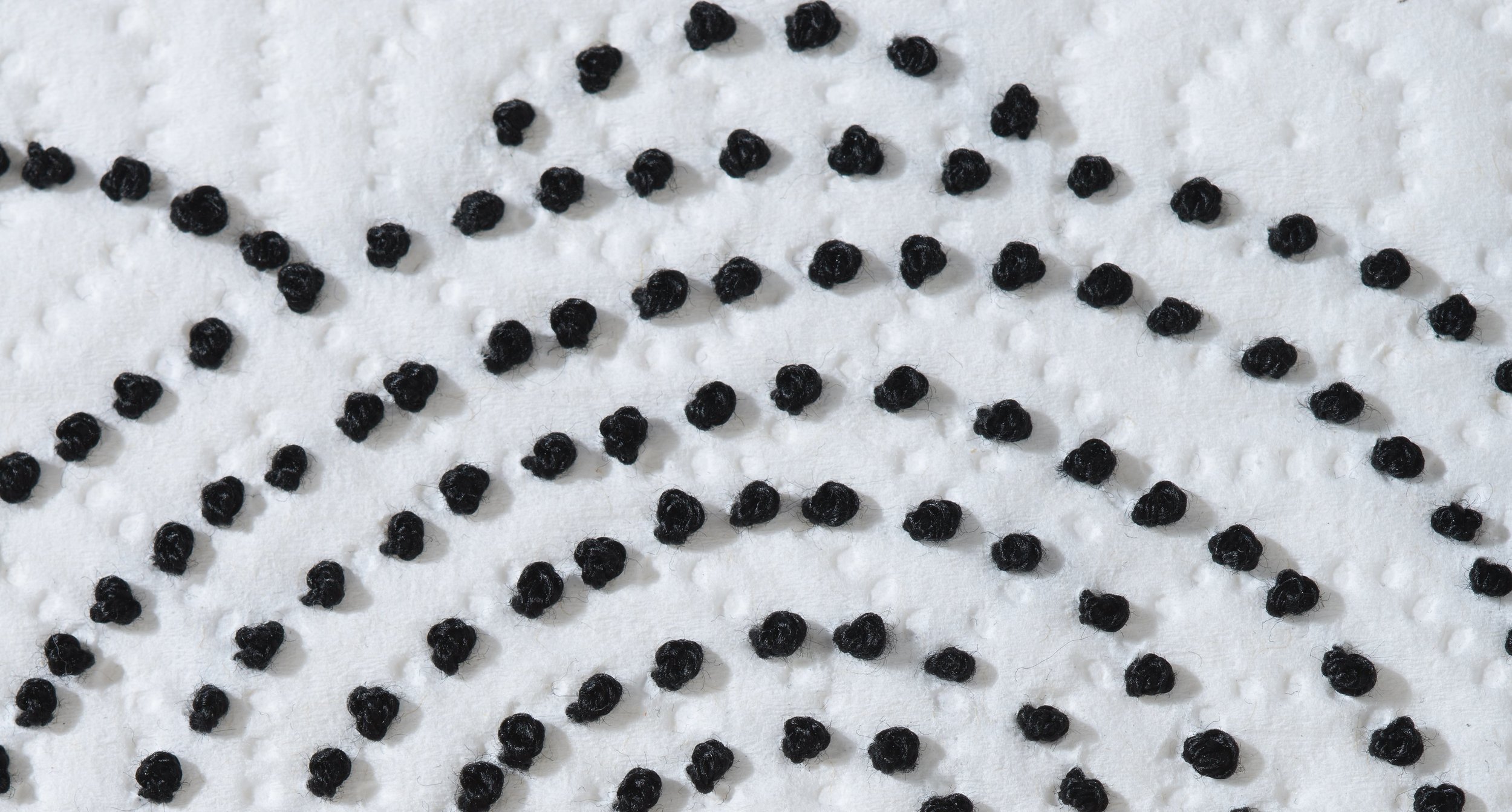
Each stitched knot represents one person who died from COVID-19 in California. I used a stitch with a spherical shape because it is a perfect reference to the shape of a coronavirus virion.
Each paper towel sheet is one day of deaths. There is a tag in the lower right hand corner of each paper towel sheet with a date and the number of people who died from COVID-19 in California on that date. That is also how many stitches are on that sheet.
Each roll is one week of deaths. The rolls are mounted to the wall, with seven sheets hanging down, starting with Sunday at the bottom, going up to Saturday at the top. Weeks progress from left to right and the diameter of each roll decreases to show the passage of time. Each roll is 7 feet tall and 15 inches wide.
The installation consists of 115 paper towel rolls representing the statistics from the first California COVID-19 death in February 2020 to the end of the Omicron wave in May 2022. (Production is continuing and will end with rolls representing May 2023, which is when the Public Health Emergency was declared over.) The current installation size requires 150 linear feet of wall space, ideally in a room that allows all four walls to have rolls installed on them so the viewer will be surrounded by statistics.
This is a magnification of the individual stitches (each stitch is 1/16” in diameter).
Each stitch represents one person in California who died from COVID-19.
The spherical shape of the stitches is a reference to the shape of a coronavirus virion.
Each paper towel sheet is one day of statistics. There is a tag in the lower right hand corner of each sheet with a date and the number of people who died from COVID-19 in California on that date. That is also how many stitches are on that sheet.
This shows how the rolls are installed.
Each roll is one week of statistics.
Weeks progress from left to right and the diameter of each roll decreases to show the passage of time.
This is 4 weeks of California COVID-19 deaths from February 21, 2021 to March 20, 2021.
This is 4 weeks of California COVID-19 deaths from January 23, 2022 to February 19, 2022.
The pattern styles change as the months of the pandemic go by, organically shifting when each new variant emerged.
There are over 100 rolls in the installation and only 12 of them have been professionally photographed and shown here. If there is a specific day or week that is meaningful to you, let me know and I can take a snapshot of it for you.
If you would like to see the project in person, a portion of it is on view at my studio, Lara’s Lab, and can be seen during open hours as listed on the Contact and Events pages.
Here are more images of the project:
These 8 rolls of embroidered paper towels depict the same 8 weeks of deaths as the blue-highlighted section on the graph.
How you can help with this project:
I am currently seeking a series of venues so this installation can travel and reach as many people as possible. If you are associated with or know of a venue or organization that would be interested in displaying this project, I would love to hear from you!
and
Okay, this is a weird one . . . I need to find more rolls of the full-sheet Trader Joe’s paper towels so I can continue production on this project. (They discontinued the regular size rolls of full-sheet paper towels and now only sell the slim rolls of half-sheet paper towels.) If you have some, please contact me. I will buy them from you (or you can donate to the arts).
”By assigning each sheet to represent a single day of statistics, the viewer gains a visceral understanding of the scale of loss experienced. The arrangement of the paper towel rolls to signify weekly statistics adds a layer of organization to the visualization. Beginning with Sunday at the base and ascending to Saturday at the top effectively captures the passage of time within each weekly segment. The left-to-right progression of weeks offers a clear chronological narrative, allowing observers to track the evolution of the crisis over time.”
— ChatGPT
(Out of curiosity, I asked AI to describe the installation.)


